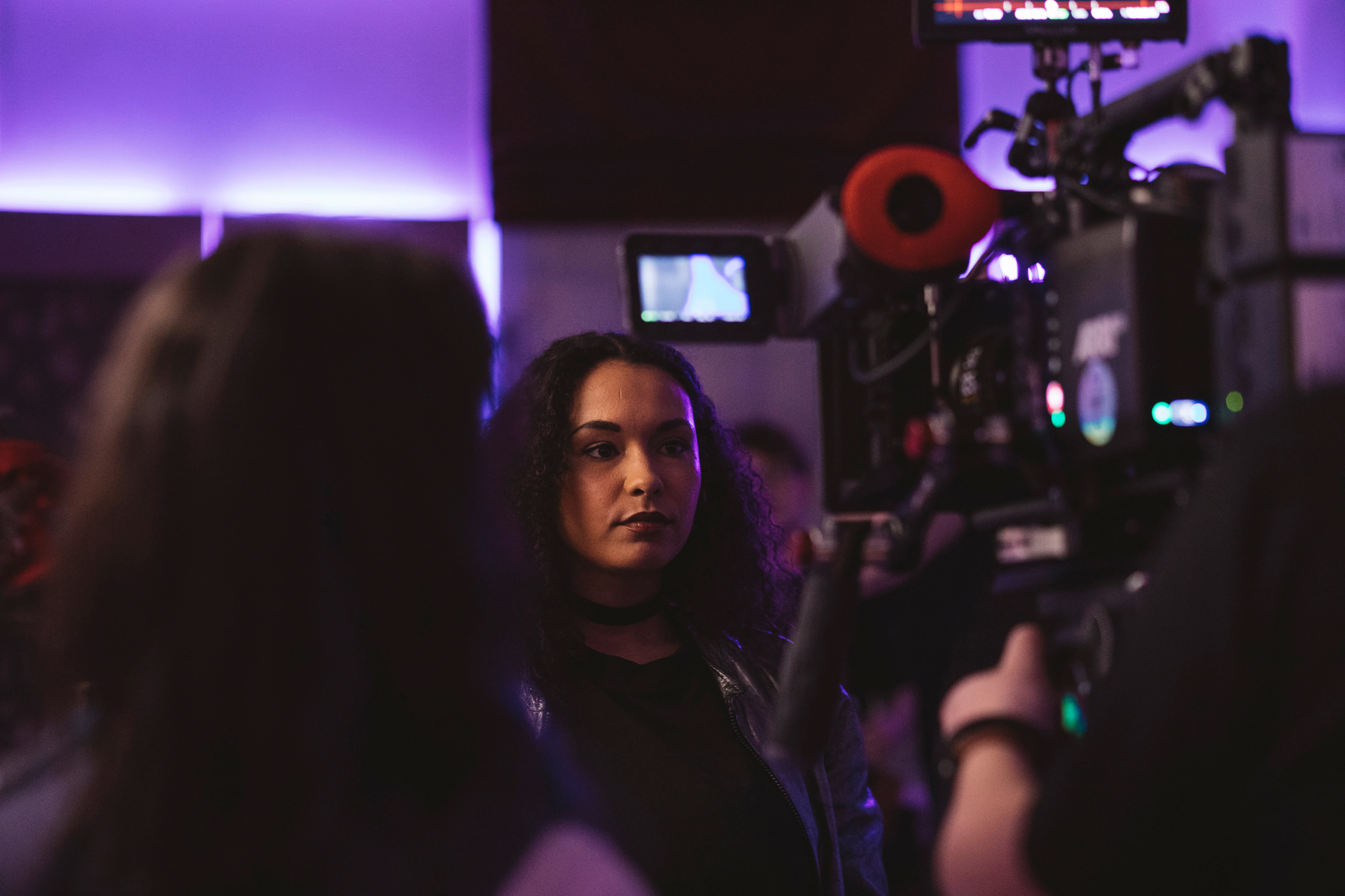
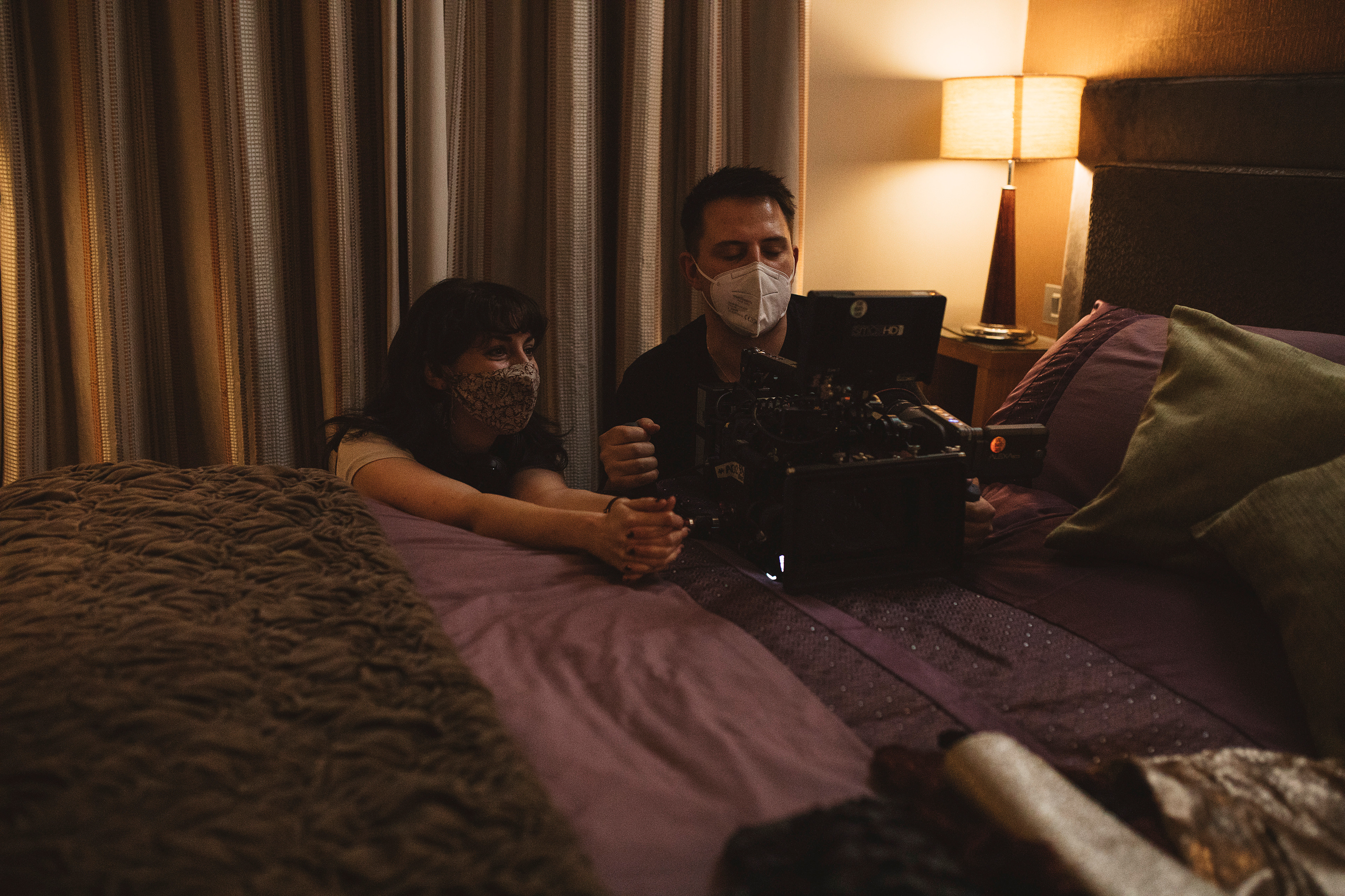
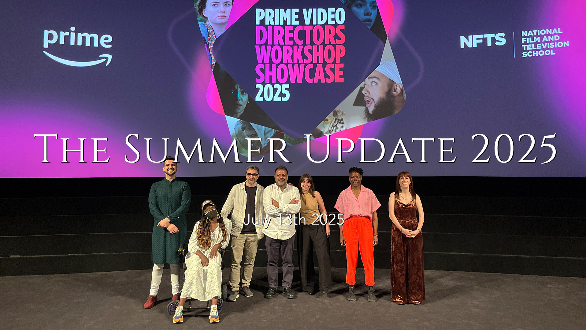
Following a festival run that included more BAFTA-qualifying selections than I've ever had before, multiple awards and nominations, and a rainy but beautiful trip to Normandy, the A Different Place team are getting ready to release the film online. We're also preparing for a limited cinema release. There's some details at the end of this post, with more to be revealed on social media as soon as I have concrete information to share; needless to say I can't wait for new audiences to watch and enjoy the film. Ahead of the online release, I thought it would be a good time to dedicate a blog post to one of my favourite elements of the film's production - the cinematography.
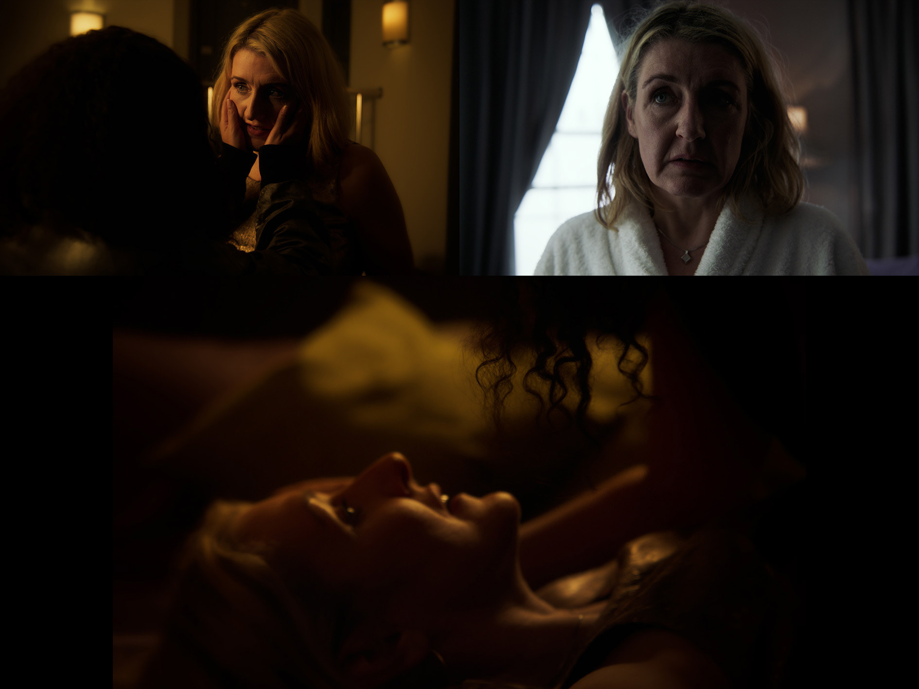
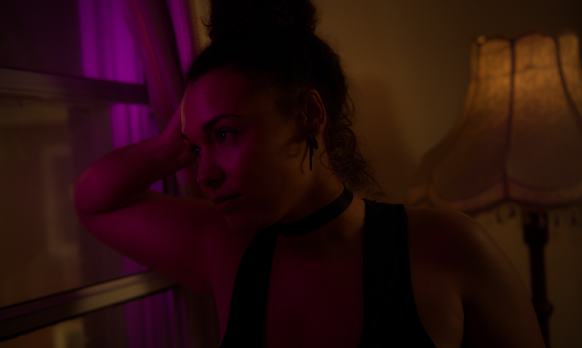
A Different Place is set in a single location, mostly just in one room, with two speaking characters, and the story takes place almost entirely over a single night. So on paper, that's a very simple project. However, due to the film's subject nature (the plot revolves around a woman choosing to have an affair in order to discover an important truth about herself), we had to approach the cinematography with a great deal of sensitivity. I knew early on that I wanted the space to look very cosy and safe on camera, intimate without being overly sexualised, with a use of shadows that would suit the night-time setting and also provide a flattering layer of security for our brave and generous cast.
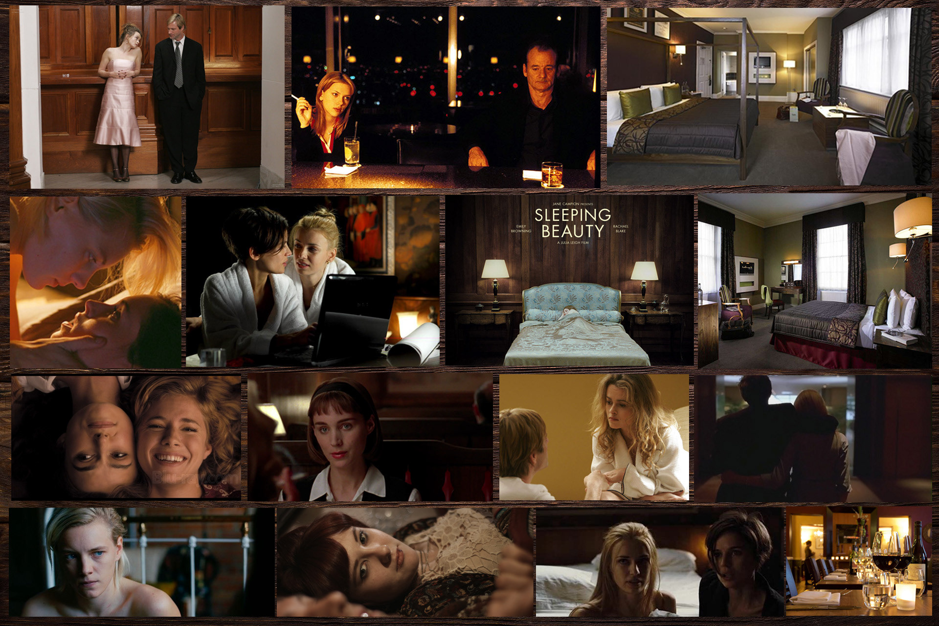
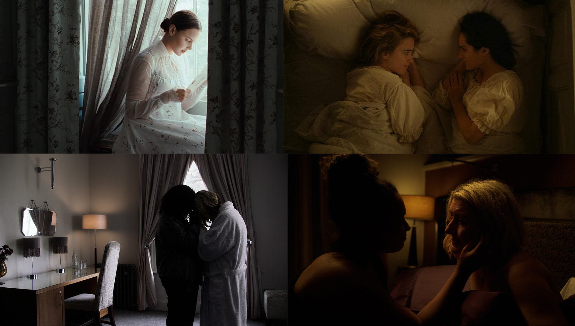
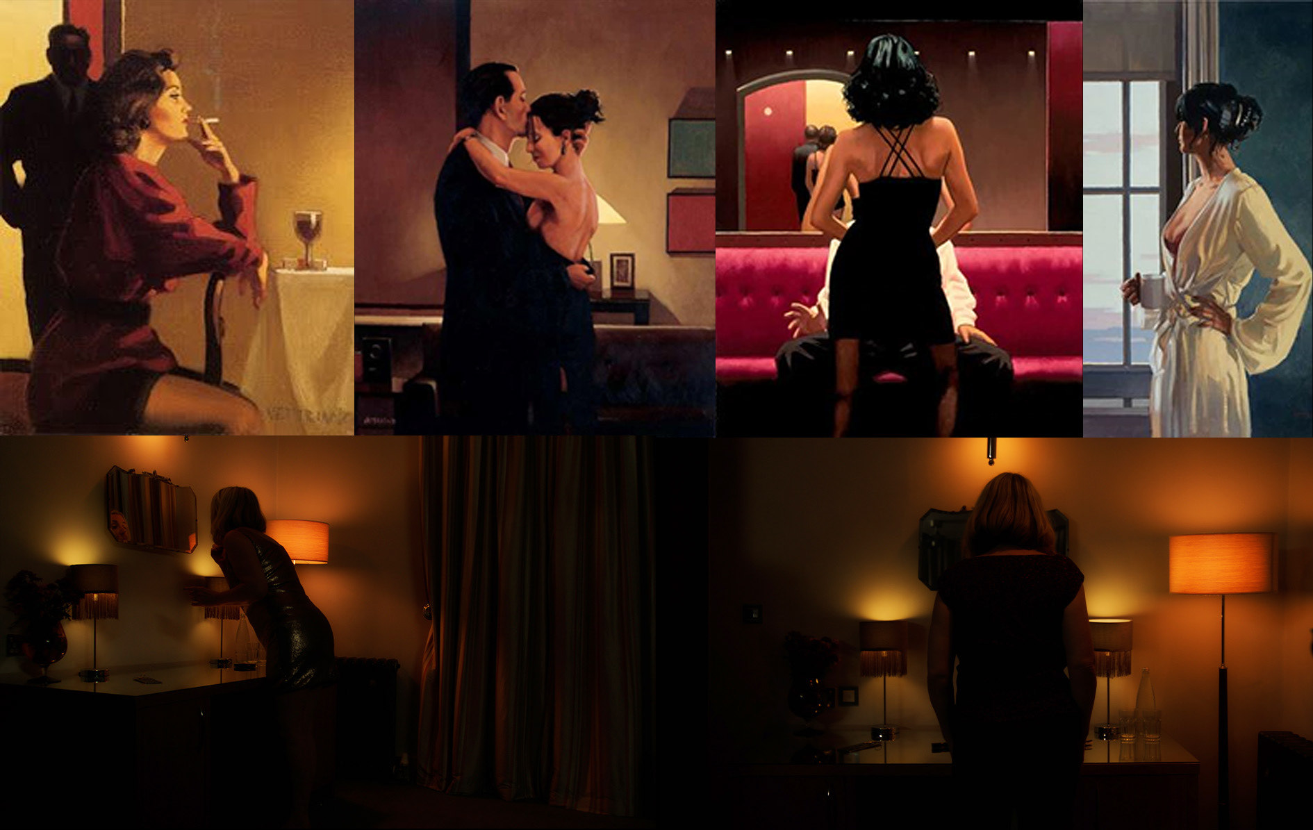
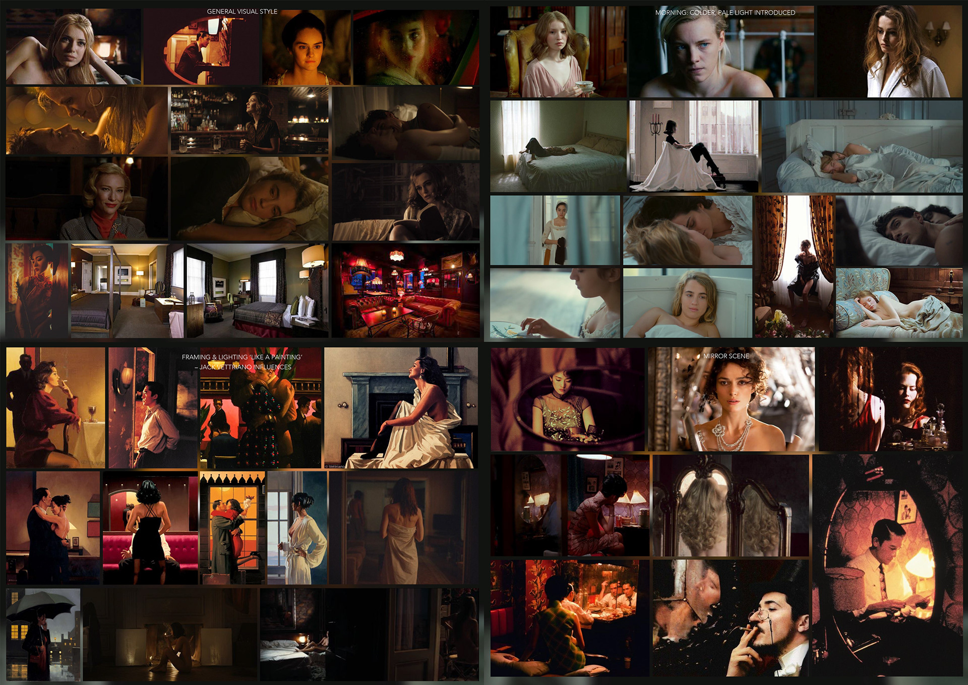
With that initial 'brief to self' in my head, my first step was to look at films with similar settings and subject natures, and I put some stills from those in a moodboard alongside photos of an early location we were considering (see below). Although I watched and researched a lot more films during pre-production, this initial moodboard helped me to select the film's colour palette, as a use of wood and brown tones was consistent across many of my early inspirations. I wanted the colours to feel warm and sensual but still feminine, so I decided that a use of pinks, non-cold purples, and reds, supported by olive and gold, would be prioritised over blue or grey tones. I later realised that many of the colours I loved for this project are present in the Lesbian Pride flag, which - if you watch the film - is clearly appropriate for this piece.